|
<< Click to Display Table of Contents >> Torque Chart |
  
|
|
<< Click to Display Table of Contents >> Torque Chart |
|
The simulation produces an X-Y chart of the torque applied to the belt at the drive pulleys at selected points during the simulated period. Data is from the case currently being evaluated, that is operating case and dynamic case.
•Selecting the Home menu item.
•Clicking the Torque tab.

The thin horizontal line indicates the motors full load torque at the pulley. With a multiple drive system, the line color indicates the drive.
A table of the minimum and maximum values for each point will be displayed with the descriptions color coded to the lines. If you click on the colored box next to a specific description, the line will be hidden from the graph. If you click the box again (it should be white), then the line will reappear.
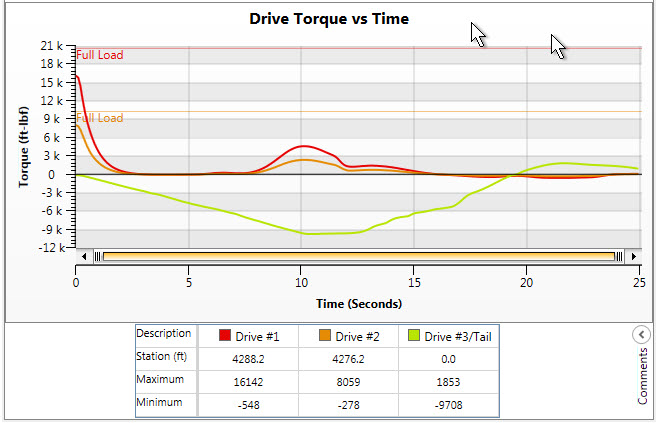
The program automatically selects all the drive and brake pulleys to display.
The chart typically displays from start (0 time) to full simulation time. This range can be reduced by dragging the scroll bar between the chart and time axis labels.
Comments can be added using the "Comments" button in the lower right corner of the window:
•Public Comments: The engineer's comments that will be displayed on the print out document.
• Private Comments: The comments that will be only displayed in the file and will not be displayed on the print out document.
Torque will only be plotted at drive or brake locations. For the chart to plot, the first two letters of the drive label must be "Dr".
A report with this chart can be created using the Print Current Report routine in DA or the Report routine in BA.
By right clicking on the chart, the user can either create a "csv" text file of the chart data or a "jpg" picture file of the image.
See Also: Plot Points, Simulation Output