|
<< Click to Display Table of Contents >> Belt Fleet Plot |
  
|
|
<< Click to Display Table of Contents >> Belt Fleet Plot |
|
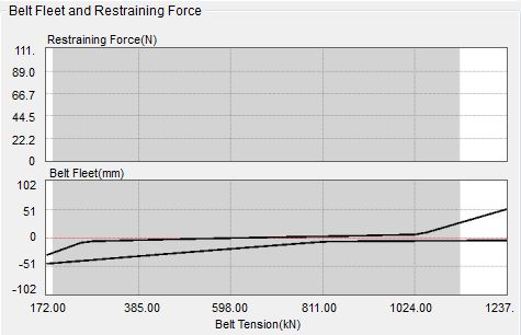
The top line represents the empty belt; the bottom line represents the loaded belt.
The gray band represents the running tension range while the white regions represent the acceleration/deceleration range.
The lower half of the graphic shows the belt lateral movement from the center of the idler from the low tension (left range) to the high tension (right range) defined above. The maximum drift is input in the idler geometry.
The upper half of the graphic shows the belt edge restraining force (if any) from the low tension (left range) to the high tension (right range) defined above.
See Also: Drift, Restraining Force